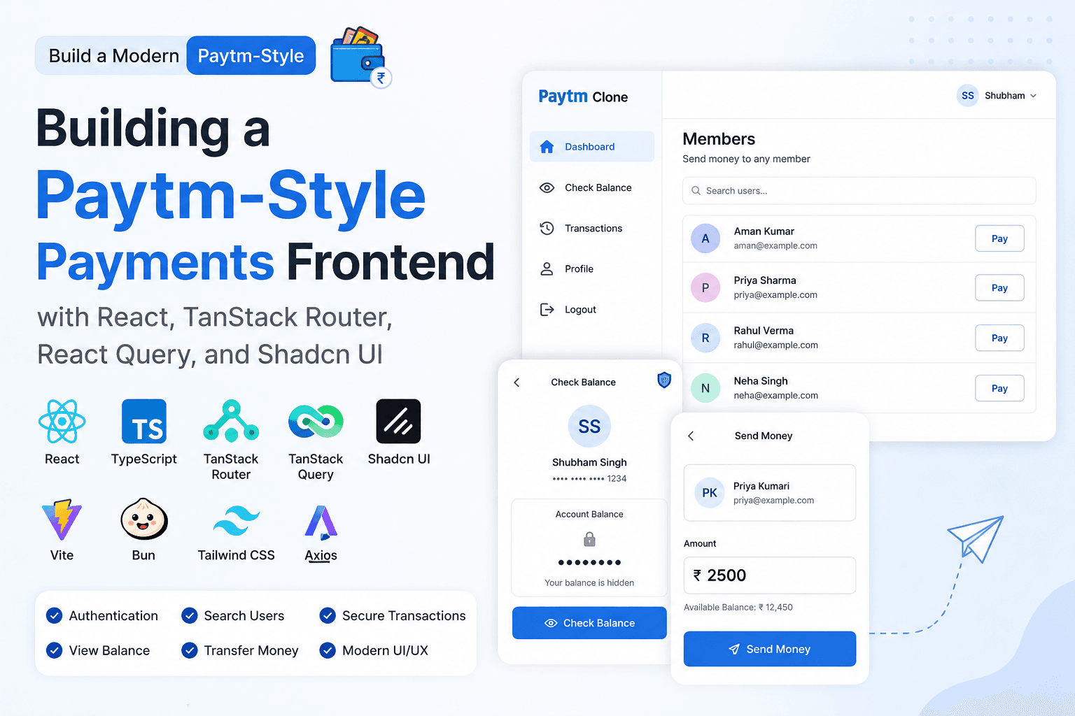
Building a ShelfLife Household Inventory Tracker — Frontend
I'm Shubham (@shubhamsinghbundela), I'm a Software Engineer, a Full-stack developer, a tech enthusiast, and a technical writer here on @Hashnode. I have a strong zeal to share my acquired knowledge and I am also willing to learn from others.
In the previous blog, we designed and built the backend architecture for ShelfLife — a collaborative household inventory tracking application focused on reducing food waste.
Backend Blog: https://shubhamsinghbundela.hashnode.dev/building-a-shelflife-household-inventory-tracker-backend
Now it’s time to build the frontend application that users will interact with daily.
Why ShelfLife?
In many shared households:
Multiple people buy groceries
Items are stored in different places
Expiry dates get ignored
Food gets wasted
ShelfLife aims to solve this problem collaboratively.
Step 1: Setting Up the Project with Vite
We start by creating the React application using Vite.
Why Vite?
Because modern frontend development requires fast feedback loops and better developer experience.
Compared to older tooling like Create React App, Vite provides:
Extremely fast startup time
Instant Hot Module Replacement (HMR)
Lightweight configuration
Faster build.
Create the project:
npm create vite@latest
Start the development server:
npm run dev
Step2: Deciding the Folder Structure
One of the most important frontend decisions is folder organization.
I followed ideas inspired by https://www.joshwcomeau.com/react/file-structure/ and adapted them for this project.
Current structure:
src/
 ├── assets/
 ├── components/
 │    ├── auth/
 │    │     └── Login.jsx
 │    │
 │    ├── dashboard/
 │    │     └── Dashboard.jsx
 │
 ├── routes/
 │    └── index.js
 │
 ├── App.jsx
 └── main.jsx
Why This Structure?
Instead of grouping everything by file type only, I grouped components by feature.
Benefits:
Better scalability
Components remain discoverable
Features stay isolated
For example:
components/auth
contains all authentication-related components.
Similarly:
components/dashboard
contains dashboard-related components.
This structure becomes extremely helpful as the application grows.
Step3 : Understanding @ Alias Imports in React + Vite
In this project, I’m using the @ alias everywhere instead of relative paths, so before moving forward, let’s understand what @ actually means ?
@ is simply an alias that points to the src folder.
Meaning:@ -> src
So:
@/components/auth/Login
actually means:
src/components/auth/Login
Why Use Alias Imports?
Without aliases, imports can become messy very quickly.
Example:
../../../components/auth/Login
As projects grow, relative paths become difficult to read and maintain.
Using aliases keeps imports clean and predictable:
@/components/auth/Login
Benefits:
Cleaner imports
Easier refactoring
Better readability
Simpler navigation in large projects
Configuring @ Alias in Vite
To make alias imports work, we need to configure Vite.
Inside:
vite.config.js
add:
import { defineConfig } from "vite";
import react from "@vitejs/plugin-react";
import path from "path";

export default defineConfig({
  plugins: [react()],

  resolve: {
    alias: {
      "@": path.resolve(__dirname, "./src"),
    },
  },
});
Understanding the Configuration
"@": path.resolve(__dirname, "./src")
means:
Whenever React sees "@",
replace it with the src folder path.
So:
@/components/dashboard/Dashboard
becomes:
src/components/dashboard/Dashboard
automatically.
Step 4: Installing React Router DOM
Since ShelfLife is a multi-page application, we need routing.
Install React Router DOM:
npm install react-router-dom
React Router DOM helps us create client-side routing without full page refreshes.
Example:
/         -> Join Household Page
/items    -> Items Dashboard
Before setting up routes, I had to decide which routing approach I wanted to use.
React Router provides multiple routing modes, but for ShelfLife I decided to use:
<BrowserRouter>
which is part of React Router’s Declarative Mode.
Why I Chose BrowserRouter
ShelfLife is primarily a dashboard-style application where most pages are accessed after authentication.
For this kind of application, client-side routing works extremely well because:
Navigation feels instant
No full page refreshes
Simpler project structure
Easier mental model
Perfect for SPA (Single Page Applications)
I did not need advanced framework features like:
Server Side Rendering (SSR)
Route loaders/actions
Full-stack routing
So using BrowserRouter kept the architecture simple and predictable.
The routing flow looks like:
BrowserRouter
   ↓
Routes
   ↓
Outlet
   ↓
Child Pages
Step 5: Setting Up Centralized Routing
I decided to use centralized route configuration.
Why?
Because I wanted:
All routes visible in one place
Simpler mental model
Predictable architecture
Better scalability
Creating the Route Configuration
Inside:
src/routes/index.js
we create all application routes.
import { lazy } from "react";

export const routes = [
  {
    path: "",
    component: lazy(() =>
      import("@/components/joinHouseHold/JoinHouseHold")
    ),
  },
  {
    path: "/items",
    component: lazy(() =>
      import("@/components/dashboard/items")
    ),
  },
];
Understanding lazy()
lazy(() => import(...))
is React’s implementation of lazy loading.
Lazy loading is a performance optimization technique where components are downloaded only when they are actually needed instead of loading everything upfront.
This means components load only when required.
Example:
JoinHouseHoldcomponent loads only when user visits/Itemscomponent loads only when user visits/items
Benefits:
Smaller initial bundle size
Better performance
Faster initial page load
Reduced unnecessary JavaScript downloads
Step 6: Creating a Shared Layout Route
Most pages inside ShelfLife share the same layout structure:
Navbar
Main Content
Footer
Instead of repeating these components inside every page, I created a reusable layout route.
Inside:
src/components/main/Body.jsx
import { Outlet } from "react-router-dom";
import Footer from "./Footer";
import Navbar from "./Navbar";

const Body = () => {
  return (
    <div
      style={{
        minHeight: "100vh",
        display: "flex",
        flexDirection: "column",
      }}
    >
      <Navbar />

      <div style={{ flex: 1 }}>
        <Outlet />
      </div>

      <Footer />
    </div>
  );
};

export default Body;
Understanding Outlet
<Outlet />
is one of the most important concepts in React Router.
It acts as a placeholder where child routes render dynamically.
Example:
/        -> JoinHouseHold renders inside Outlet
/items   -> Items page renders inside Outlet
This allows us to create reusable layouts very easily.
The final layout structure becomes:
Navbar
   ↓
Outlet (Dynamic Page Content)
   ↓
Footer
Step 7: Configuring the App Router
Inside:
src/App.jsx
import { Suspense } from "react";
import "@/App.css";

import {
  BrowserRouter,
  Routes,
  Route,
} from "react-router-dom";

import Body from "@/components/main/Body";
import { routes } from "@/routes";

function App() {
  return (
    <BrowserRouter>
      <Suspense fallback={<h1>Loading...</h1>}>
        <Routes>
          <Route path="/" element={<Body />}>
            {routes.map((route) => {
              const Component = route.component;

              return (
                <Route
                  key={route.path}
                  path={route.path}
                  element={<Component />}
                />
              );
            })}
          </Route>
        </Routes>
      </Suspense>
    </BrowserRouter>
  );
}

export default App;
Understanding BrowserRouter
<BrowserRouter>
enables browser-based client-side routing using URLs.
Without it, React Router cannot manage page navigation.
Understanding Routes
<Routes>
acts as a container for all route definitions.
Understanding Route
<Route path="/items" element={<Items />} />
means:
/items -> render Items component
Understanding Suspense
Since we are using lazy loading, React needs a fallback UI while components are downloading.
<Suspense fallback={<h1>Loading...</h1>}>
shows loading content until the lazy-loaded component becomes available.
Step 8: Setting Up Material UI
Now that the routing architecture was ready, the next step was building the actual user interface for ShelfLife.
For the frontend UI library, I decided to use Material UI.
Why Material UI?
Because ShelfLife is a dashboard-oriented application and Material UI provides:
Prebuilt production-ready components
Consistent design system
Faster UI development
Excellent form components
Responsive layouts
Theme customization support
This allows us to focus more on application logic instead of spending excessive time building UI components from scratch.
Installing Material UI
To install Material UI and its required styling dependencies:
npm install @mui/material @emotion/react @emotion/styled
Understanding Emotion
You may notice two additional packages:
@emotion/react
@emotion/styled
Material UI uses Emotion internally as its styling engine.
Emotion helps Material UI:
Generate dynamic styles
Handle component-based styling
Support theming
Optimize CSS performance
Without these packages, Material UI components will not work properly.
Creating the Global Theme
Since ShelfLife is focused on freshness tracking and inventory management, I wanted the application to have a green-themed design system representing freshness and sustainability.
Inside:
src/theme.js
we create a global Material UI theme.
import { createTheme } from "@mui/material/styles";

const theme = createTheme({
  palette: {
    primary: {
      main: "#2e7d32",
    },

    secondary: {
      main: "#66bb6a",
    },

    background: {
      default: "#f4f9f4",
      paper: "#ffffff",
    },
  },
});

export default theme;
Understanding createTheme()
createTheme()
creates a centralized design system for the application.
This allows all Material UI components to automatically use the same:
Colors
Typography
Spacing system
Component styling
For example:
<Button color="primary" />
will automatically use:
#2e7d32
from the theme configuration.
Configuring ThemeProvider
To apply the theme globally, we wrap the application with:
<ThemeProvider>
Inside:
src/main.jsx
import React from "react";
import ReactDOM from "react-dom/client";

import App from "./App";

import {
  ThemeProvider,
} from "@mui/material/styles";

import CssBaseline from "@mui/material/CssBaseline";

import theme from "./theme";

ReactDOM.createRoot(
  document.getElementById("root")
).render(
  <ThemeProvider theme={theme}>
    <CssBaseline />
    <App />
  </ThemeProvider>
);
Understanding CssBaseline
<CssBaseline />
acts as a global CSS reset for Material UI applications.
It helps:
Remove inconsistent browser styling
Apply cleaner default styles
Normalize margins and typography
Apply the theme background globally
Step 9: Setting Up Global State Management with Redux Toolkit
As ShelfLife started growing, managing shared application state became important.
For example:
Logged-in user information
Authentication state
Household data
Shared inventory information
Passing this data manually through props across multiple components would quickly become difficult to maintain.
To solve this, I decided to use Redux Toolkit.
Installing Redux Toolkit
To set up Redux Toolkit, install:
npm install @reduxjs/toolkit react-redux
Understanding the Packages
@reduxjs/toolkit
provides the modern Redux APIs for creating stores and slices.
react-redux
connects Redux with React components.
I followed the official Redux Toolkit Quick Start documentation:
Redux Toolkit Quick Start Guide
Why I Introduced Redux Toolkit
As the application started interacting with the backend API, multiple components needed access to the same server-side data.
For example:
Logged-in user information
Household details
Shared inventory items
Authentication state
Without global state management, this data would need to be passed manually through props across many components, which quickly becomes difficult to maintain.
To solve this, I introduced Redux Toolkit as a centralized global store for managing server-driven application state.
The idea is simple:
Backend API
    ↓
Frontend fetches data
    ↓
Redux Store
    ↓
Any Component Can Access It
This allows data coming from the server to be stored centrally and shared across the entire application efficiently.
Benefits of This Approach
Avoids prop drilling
Centralized application state
Easier data sharing between components
Creating the Global Store
Inside:
src/store/appStore.js
I created the main Redux store.
import { configureStore } from "@reduxjs/toolkit";
import userReducer from "./userSlice";

const appStore = configureStore({
  reducer: {
    user: userReducer,
  },
});

export default appStore;
The store acts as a centralized container for the entire application state.
Current store structure:
store
 └── user
Creating the User Slice
Redux Toolkit organizes state into smaller isolated pieces called slices.
Inside:
src/store/userSlice.js
I created the user slice.
import { createSlice } from "@reduxjs/toolkit";

const userSlice = createSlice({
  name: "user",
  initialState: null,

  reducers: {
    addUser: (state, action) => {
      return action.payload;
    },

    removeUser: (state, action) => {
      return null;
    },
  },
});

export const { addUser, removeUser } = userSlice.actions;

export default userSlice.reducer;
Providing the Redux Store to the Application
After creating the store, the next step was making it accessible throughout the entire application.
Inside:
src/App.jsx
I wrapped the application using Redux Provider.
import { Provider } from "react-redux";
import appStore from "@/store/appStore";

<Provider store={appStore}>
  <BrowserRouter>
    <App />
  </BrowserRouter>
</Provider>
Understanding Provider
<Provider>
connects React with the Redux store.
Without it, components cannot access global state.
Once wrapped, any component inside the application can:
Read state using
useSelectorUpdate state using
useDispatch
Step 10: Setting Up Axios
Now let’s connect the frontend with the backend
Axios helps simplify:
API requests
Request configuration
Error handling
Interceptors
Installing Axios
Install Axios:
npm install axios
Creating Environment Variables
Instead of hardcoding backend URLs, I used environment variables.
Inside:
.env
VITE_API_URL=http://localhost:5000/api
Since this project uses Vite, environment variables must start with:
VITE_
Otherwise, Vite will not expose them to the frontend application.
Creating the Axios Instance
Inside:
src/api/axios.js
import axios from "axios";

const api = axios.create({
  baseURL: import.meta.env.VITE_API_URL,

  withCredentials: true,

  timeout: 10000,
});

export default api;
Understanding the Configurationaxios.create()
Creates a reusable Axios instance.
Instead of repeating configuration in every API request, we centralize everything in one place.
baseURL
Sets the backend base URL globally.
So this:
api.post("/auth/login")
automatically becomes:
http://localhost:5000/api/auth/login
withCredentials: true
Allows cookies to be sent automatically with requests.
This becomes important for refresh token authentication because refresh tokens are stored securely inside HTTP-only cookies.
timeout: 10000
Axios will wait a maximum of:
10000 milliseconds = 10 seconds
before aborting the request.
This prevents requests from hanging forever if the server does not respond.
Setting Up Token Utilities
After login, the backend returns an access token.
To manage tokens cleanly, I created utility functions.
Inside:
src/utils/token.js
export const getAccessToken = () =>
  localStorage.getItem("accessToken");

export const setAccessToken = (token) =>
  localStorage.setItem(
    "accessToken",
    token
  );

export const clearTokens = () => {
  localStorage.removeItem(
    "accessToken"
  );
};
Why Create Token Utilities?
Instead of directly using:
localStorage.getItem()
everywhere, utility functions help:
Centralize token logic
Improve readability
Reduce duplication
Setting Up Axios Interceptors
Authentication systems usually require automatic token handling.
To solve this, I used Axios interceptors.
Inside:
src/api/axiosInterceptor.js
import { refreshToken } from "./auth.api";
import api from "./axios";
import { getAccessToken, setAccessToken, clearTokens } from "@/utils/token";

// REQUEST INTERCEPTOR
api.interceptors.request.use((config) => {
  const token = getAccessToken();

  if (token) {
    config.headers.Authorization = `Bearer ${token}`;
  }

  return config;
});

// RESPONSE INTERCEPTOR
api.interceptors.response.use(
  (response) => response,

  async (error) => {
    const originalRequest = error.config;

    if (error.response?.status === 401 && !originalRequest._retry) {
      originalRequest._retry = true;

      try {
        const res = await refreshToken();
        console.log(res);
        const newAccessToken = res.data.data.accessToken;

        setAccessToken(newAccessToken);

        api.defaults.headers.common.Authorization = `Bearer ${newAccessToken}`;

        originalRequest.headers.Authorization = `Bearer ${newAccessToken}`;

        return api(originalRequest);
      } catch (error) {
        clearTokens();

        return Promise.reject(error);
      }
    }

    return Promise.reject(error);
  },
);
Importing the Axios Interceptor
Axios interceptors only work after the interceptor file is imported.
So we need to import it once inside the main application entry file.
Inside:
src/main.jsx
import React from "react";
import ReactDOM from "react-dom/client";
import App from "./App";

import "./api/axiosInterceptor";

ReactDOM.createRoot(
  document.getElementById("root")
).render(
  <React.StrictMode>
    <App />
  </React.StrictMode>
);
Why Is This Import Important?
The interceptor file does not export a component.
Its purpose is to execute this code immediately:
api.interceptors.request.use()
and
api.interceptors.response.use()
As soon as the file is imported, Axios registers both interceptors globally.
Without importing this file, the interceptors will never run.
That means:
Tokens will not attach automatically
Refresh token logic will not work
Expired access tokens will not refresh automatically
Step 11: Building the Shared Navigation Layout
Most pages inside ShelfLife share a common structure:
Navbar
Dynamic Page Content
Footer
So instead of repeating them on every page, I created reusable layout components.
Creating the Navbar
Inside:
src/components/main/Navbar.jsx
import * as React from "react";
import AppBar from "@mui/material/AppBar";
import Box from "@mui/material/Box";
import Toolbar from "@mui/material/Toolbar";
import IconButton from "@mui/material/IconButton";
import Typography from "@mui/material/Typography";
import Menu from "@mui/material/Menu";
import MenuIcon from "@mui/icons-material/Menu";
import Container from "@mui/material/Container";
import Avatar from "@mui/material/Avatar";
import Button from "@mui/material/Button";
import Tooltip from "@mui/material/Tooltip";
import MenuItem from "@mui/material/MenuItem";
import AdbIcon from "@mui/icons-material/Adb";
import { useDispatch, useSelector } from "react-redux";
import { logout } from "./api";
import { clearTokens } from "@/utils/token";
import { useNavigate } from "react-router-dom";
import { removeUser } from "@/store/userSlice";
import { toast } from "react-toastify";

const pages = ["Products", "Pricing", "Blog"];
const settings = ["Profile", "Logout"];

const Navbar = ({ setOpenAuthDialog }) => {
  const user = useSelector((store) => store.user);
  const dispatch = useDispatch();
  const navigate = useNavigate();
  const [anchorElNav, setAnchorElNav] = React.useState(null);
  const [anchorElUser, setAnchorElUser] = React.useState(null);

  const handleOpenNavMenu = (event) => {
    setAnchorElNav(event.currentTarget);
  };
  const handleOpenUserMenu = (event) => {
    setAnchorElUser(event.currentTarget);
  };

  const handleCloseNavMenu = () => {
    setAnchorElNav(null);
  };

  const handleCloseUserMenu = () => {
    setAnchorElUser(null);
  };

  const handleSettingsClick = async (setting) => {
    handleCloseUserMenu();

    if (setting === "Logout") {
      try {
        await logout(); // API call

        clearTokens();

        // remove redux user also
        dispatch(removeUser());

        toast.success("Logout Successful");
        navigate("/");
      } catch (error) {
        console.log(error);
      }
    }
  };

  return (
    <AppBar position="static">
      <Container maxWidth="xl">
        <Toolbar
          disableGutters
          sx={{
            minHeight: "56px !important",
          }}
        >
          <Typography
            variant="h6"
            noWrap
            sx={{
              mr: 2,
              display: { xs: "none", md: "flex" },
              fontFamily: "monospace",
              fontWeight: 700,
              letterSpacing: ".3rem",
              color: "inherit",
              textDecoration: "none",
            }}
          >
            ShelfLife
          </Typography>

          <Typography
            variant="h5"
            noWrap
            component="a"
            href="#app-bar-with-responsive-menu"
            sx={{
              mr: 2,
              display: { xs: "flex", md: "none" },
              flexGrow: 1,
              fontFamily: "monospace",
              fontWeight: 700,
              letterSpacing: ".3rem",
              color: "inherit",
              textDecoration: "none",
            }}
          >
            ShelfLife
          </Typography>
          <Box
            sx={{ flexGrow: 1, display: "flex", justifyContent: "flex-end" }}
          >
            {!user ? (
              <Button
                variant="contained"
                onClick={() => setOpenAuthDialog(true)}
              >
                Login
              </Button>
            ) : (
              <>
                <Tooltip title="Open settings">
                  <IconButton onClick={handleOpenUserMenu} sx={{ p: 0 }}>
                    <Avatar
                      alt="Remy Sharp"
                      src="/static/images/avatar/2.jpg"
                    />
                  </IconButton>
                </Tooltip>
                <Menu
                  sx={{ mt: "45px" }}
                  id="menu-appbar"
                  anchorEl={anchorElUser}
                  anchorOrigin={{
                    vertical: "top",
                    horizontal: "right",
                  }}
                  keepMounted
                  transformOrigin={{
                    vertical: "top",
                    horizontal: "right",
                  }}
                  open={Boolean(anchorElUser)}
                  onClose={handleCloseUserMenu}
                >
                  {settings.map((setting) => (
                    <MenuItem
                      key={setting}
                      onClick={() => handleSettingsClick(setting)}
                    >
                      <Typography sx={{ textAlign: "center" }}>
                        {setting}
                      </Typography>
                    </MenuItem>
                  ))}
                </Menu>
              </>
            )}
          </Box>
        </Toolbar>
      </Container>
    </AppBar>
  );
};

export default Navbar;
I created the application navbar.
The navbar has two authentication states:
User Not Logged In
        ↓
Show Login Button

User Logged In
        ↓
Show Profile Menu
This behavior is controlled using Redux global state.
const user = useSelector((store) => store.user);
Understanding useSelector()
useSelector()
allows React components to access Redux store data.
If no user exists:
<Button onClick={() => setOpenAuthDialog(true)}>
  Login
</Button>
the Login button appears.
Otherwise:
<Avatar />
shows the authenticated user profile menu.
This creates a dynamic authentication-aware navigation system.
Handling Logout
Inside the profile menu, I added logout functionality.
dispatch(removeUser());
removes the authenticated user from Redux state.
At the same time:
clearTokens();
removes stored access tokens from localStorage.
This instantly updates the entire UI because Redux state changes automatically trigger component re-renders.


Creating the Footer
Inside:
src/components/main/Footer.jsx
I created a shared footer component.
import { Box, Container, Typography } from "@mui/material";

const Footer = () => {
  return (
    <Box
      component="footer"
      sx={{
        mt: "auto",
        py: 2,
        textAlign: "center",
        bgcolor: "primary.main",
        color: "white",
      }}
    >
      <Container maxWidth="xl">
        <Typography variant="body2">
          © 2026 ShelfLife. All rights reserved.
        </Typography>
      </Container>
    </Box>
  );
};

export default Footer;

Step12: Connecting Navbar with the Login Dialog
Before building the Login component, I updated the shared layout component so the Navbar could control the authentication dialog.
Inside:
src/components/main/Body.jsx
I added dialog state management.
const [openAuthDialog, setOpenAuthDialog] =
  useState(false);
This state controls whether the authentication modal is open or closed.
Passing State to Navbar
<Navbar
  setOpenAuthDialog={
    setOpenAuthDialog
  }
/>
The setOpenAuthDialog function is passed to the Navbar component as a prop.
This allows the Navbar to open the Login dialog whenever the user clicks the Login button.
Example inside Navbar:
<Button
  variant="contained"
  onClick={() =>
    setOpenAuthDialog(true)
  }
>
  Login
</Button>
When clicked:
setOpenAuthDialog(true);
opens the authentication modal instantly.
Sharing Dialog State with Nested Routes
<Outlet
  context={{
    openAuthDialog,
    setOpenAuthDialog,
  }}
/>
Using React Router's Outlet context, nested pages can also access:
openAuthDialogsetOpenAuthDialog
This makes the authentication modal globally accessible across shared layout routes.
Authentication Dialog Flow
User Clicks Login
        ↓
Navbar Updates State
        ↓
openAuthDialog = true
        ↓
Login Component Opens
This creates a centralized modal authentication system controlled from the shared layout.
Step 13: Building the Signup Component
Inside:
src/components/auth/Signup.jsx
we create the signup form for new users.
This component handles:
User registration form
Form validation
API integration
Error
Creating the Signup Component
Inside
src/components/auth/Signup.jsx
import { useForm } from "react-hook-form";

import CloseIcon from "@mui/icons-material/Close";

import {
  Button,
  Dialog,
  DialogContent,
  DialogTitle,
  IconButton,
  TextField,
  Typography,
  Box,
} from "@mui/material";

import { toast } from "react-toastify";

import { signupUser } from "./api";

const Signup = ({
  open,
  handleClose,
  openLogin,
}) => {
  const {
    register,
    handleSubmit,
    formState: { errors },
  } = useForm();

  const onSubmit = async (data) => {
    try {
      const res =
        await signupUser(data);

      if (res.success) {
        toast.success(
          "Signup Successful"
        );

        handleClose();

        openLogin();
      }
    } catch (err) {
      toast.error("Signup Failed");

      console.error(err);
    }
  };

  return (
    <Dialog
      open={open}
      onClose={handleClose}
      fullWidth
      maxWidth="xs"
      disableScrollLock
    >
      <DialogTitle
        sx={{
          display: "flex",
          justifyContent:
            "space-between",
          alignItems: "center",
        }}
      >
        Create Account

        <IconButton
          onClick={handleClose}
        >
          <CloseIcon />
        </IconButton>
      </DialogTitle>

      <DialogContent>
        <Box
          component="form"
          onSubmit={handleSubmit(
            onSubmit
          )}
        >
          <TextField
            margin="dense"
            label="First Name"
            fullWidth
            {...register(
              "firstName",
              {
                required:
                  "First name is required",
              }
            )}
            error={
              !!errors.firstName
            }
            helperText={
              errors.firstName
                ?.message
            }
          />

          <TextField
            margin="dense"
            label="Last Name"
            fullWidth
            {...register(
              "lastName",
              {
                required:
                  "Last name is required",
              }
            )}
            error={
              !!errors.lastName
            }
            helperText={
              errors.lastName
                ?.message
            }
          />

          <TextField
            margin="dense"
            label="Username"
            fullWidth
            {...register(
              "username",
              {
                required:
                  "Username is required",
              }
            )}
            error={
              !!errors.username
            }
            helperText={
              errors.username
                ?.message
            }
          />

          <TextField
            margin="dense"
            label="Email"
            type="email"
            fullWidth
            {...register("email", {
              required:
                "Email is required",
            })}
            error={!!errors.email}
            helperText={
              errors.email?.message
            }
          />

          <TextField
            margin="dense"
            label="Phone Number"
            type="tel"
            fullWidth
            {...register(
              "phoneNumber",
              {
                required:
                  "Phone number is required",
              }
            )}
            error={
              !!errors.phoneNumber
            }
            helperText={
              errors.phoneNumber
                ?.message
            }
          />

          <TextField
            margin="dense"
            label="Password"
            type="password"
            fullWidth
            {...register(
              "password",
              {
                required:
                  "Password is required",

                minLength: {
                  value: 6,
                  message:
                    "Password must be at least 6 characters",
                },
              }
            )}
            error={
              !!errors.password
            }
            helperText={
              errors.password
                ?.message
            }
          />

          <Typography
            variant="body2"
            sx={{
              mt: 2,
              cursor: "pointer",
              color: "primary.main",
              textAlign: "center",
            }}
            onClick={openLogin}
          >
            Already have an account?
            Login
          </Typography>

          <Box
            sx={{
              mt: 3,
              display: "flex",
              justifyContent:
                "center",
            }}
          >
            <Button
              type="submit"
              variant="contained"
            >
              Signup
            </Button>
          </Box>
        </Box>
      </DialogContent>
    </Dialog>
  );
};

export default Signup;
Creating the Signup API
Inside:
src/components/auth/api.js
import api from "@/api/axios.js";

// SIGNUP USER
export const signupUser =
  async (data) => {
    const res = await api.post(
      "/auth/register",
      data
    );

    return res.data;
  };
After successful registration:
openLogin();
automatically opens the login dialog.
This creates a smooth connected authentication experience:
Signup
   ↓
Account Created
   ↓
Open Login Dialog
   ↓
Login Dialog
Instead of forcing users to manually reopen the login modal, the application guides them directly into Login component.

Step 14: Building the Login Component
Inside:
src/components/auth/Login.jsx
we create the login form.
import { useForm } from "react-hook-form";
import { useDispatch } from "react-redux";
import { useNavigate } from "react-router-dom";

import {
  Button,
  Dialog,
  DialogContent,
  DialogTitle,
  IconButton,
  TextField,
  Typography,
  Box,
} from "@mui/material";
import { toast } from "react-toastify";

import CloseIcon from "@mui/icons-material/Close";
import { loginUser } from "./api";
import { addUser } from "@/store/userSlice";
import { setAccessToken } from "@/utils/token";

const Login = ({ open, handleClose, openSignup }) => {
  const {
    register,
    handleSubmit,
    formState: { errors },
  } = useForm();

  const dispatch = useDispatch();
  const navigate = useNavigate();

  const onSubmit = async (data) => {
    try {
      const res = await loginUser(data);
      dispatch(addUser(res.data.user));
      setAccessToken(res.data.accessToken);
      toast.success("Login Successful");
      handleClose();
    } catch (err) {
      toast.error("Invalid Credentials");
      console.error(err);
    }
  };

  return (
    <Dialog
      open={open}
      onClose={handleClose}
      fullWidth
      maxWidth="sm"
      disableScrollLock
    >
      <DialogTitle
        sx={{
          display: "flex",
          justifyContent: "space-between",
          alignItems: "center",
        }}
      >
        Login
        <IconButton onClick={handleClose}>
          <CloseIcon />
        </IconButton>
      </DialogTitle>

      <DialogContent>
        <Box component="form" onSubmit={handleSubmit(onSubmit)}>
          <TextField
            margin="dense"
            label="Email"
            type="email"
            fullWidth
            variant="outlined"
            {...register("email", {
              required: "Email is required",
            })}
            error={!!errors.email}
            helperText={errors.email?.message}
          />

          <TextField
            margin="dense"
            label="Password"
            type="password"
            fullWidth
            variant="outlined"
            {...register("password", {
              required: "Password is required",
              minLength: {
                value: 6,
                message: "Password must be at least 6 characters",
              },
            })}
            error={!!errors.password}
            helperText={errors.password?.message}
          />

          <Typography
            variant="body2"
            sx={{
              mt: 2,
              cursor: "pointer",
              color: "primary.main",
              textAlign: "center",
            }}
            onClick={openSignup}
          >
            Create new account
          </Typography>

          <Box
            sx={{
              mt: 3,
              display: "flex",
              justifyContent: "center",
            }}
          >
            <Button type="submit" variant="contained">
              Login
            </Button>
          </Box>
        </Box>
      </DialogContent>
    </Dialog>
  );
};

export default Login;
Creating the Login API
Inside:
src/components/auth/api.js
import api from "@/api/axios.js";

// LOGIN
export const loginUser = async (data) => {
  const res = await api.post("/auth/login", data);
  return res.data;
};
After successful login :
Instead of navigating users to a separate login page, I decided to use modal-based authentication.
Why?
Because it creates a smoother user experience. Users can authenticate without leaving their current page.

Understanding React Hook Form
Instead of manually managing every input using:
useState()
I used:
useForm()
from React Hook Form.
Install:
npm install react-hook-form
Inside the component:
const {
  register,
  handleSubmit,
  formState: { errors },
} = useForm();
This helps manage:
Form state
Validation
Submission handling
Error handling
with minimal re-renders.
Understanding register()
register("email")
connects the input field to React Hook Form.
This allows React Hook Form to automatically track:
Input values
Validation state
Errors
Submission data
without needing multiple state variables.
Understanding handleSubmit()
handleSubmit(onSubmit)
handles passing clean form data to the submit function.
Understanding Validation
Validation rules are added directly during field registration.
Example:
register("password", {
  required: "Password is required",

  minLength: {
    value: 6,
    message:
      "Password must be at least 6 characters",
  },
})
This automatically validates the field before submission.
See:

Understanding Error Handling
Material UI integrates nicely with React Hook Form.
Example:
error={Boolean(errors.email)}

helperText={errors.email?.message}
error
error={Boolean(errors.email)}
puts the TextField into an error state if validation fails.
helperText
helperText={errors.email?.message}
displays the actual validation message below the input field.
This creates a much better user experience compared to manual validation handling.
See:

Step15: Rendering Login and Signup Components
Inside:
src/components/joinHousehold/JoinHouseHold.jsx
I rendered both authentication components.
import { useOutletContext } from "react-router-dom";

const JoinHouseHold = () => {
   const { openAuthDialog, setOpenAuthDialog } = useOutletContext();
   const [openSignup, setOpenSignup] = useState(false);

   return (
        <>
            {!openSignup ? (
               <Login
                  open={openAuthDialog}
                  handleClose={() => setOpenAuthDialog(false)}
                  openSignup={() => {
                      setOpenAuthDialog(false);
                      setOpenSignup(true);
                   }}
                 />
              ) : (
                 <Signup
                    open={openSignup}
                    handleClose={() => setOpenSignup(false)}
                    openLogin={() => {
                       setOpenSignup(false);
                       setOpenAuthDialog(true);
                     }}
                   />
                )}
         </>
    )
};

export default JoinHouseHold;
Initially:
openSignup = false
So the Login component is rendered.
When users click:
Create new account
inside the Login dialog:
setOpenAuthDialog(false);

setOpenSignup(true);
closes the Login modal and opens the Signup modal.
Similarly, after successful signup:
openLogin();
inside the Signup component:
setOpenSignup(false);

setOpenAuthDialog(true);
closes the Signup dialog and reopens the Login dialog.
This creates a connected modal-based authentication flow:
Login Dialog
      ↓
Create Account
      ↓
Signup Dialog
      ↓
Account Created
      ↓
Login Dialog
Step 16: Persistent Authentication
One major problem in frontend authentication is:
Redux state resets after page refresh
To solve this, ShelfLife restores the user session whenever the application loads.
Inside:
src/components/main/Body.jsx
I added authentication handling logic to manage:
Persistent login
User fetching
useEffect(() => {
  const token =
    localStorage.getItem(
      "accessToken"
    );

  if (token) {
    fetchUser();
  }
}, []);
The application first checks whether an access token already exists.
If a token is found:
fetchUser();
calls the backend API to retrieve the authenticated user's data.
Fetching the Authenticated User
const fetchUser = async () => {
  try {
    const res = await getMe();

    dispatch(addUser(res.user));
  } catch (error) {
    toast.error(
      error?.response?.data?.message ||
        "Failed to fetch user"
    );
  }
};
Once the backend returns the user data:
dispatch(addUser(res.user));
stores the user globally inside Redux.
This allows every component in the application to access authenticated user information.
Why This Step Is Important
Without this logic:
User data disappears after refresh
Navbar loses authentication state
Protected routes stop working properly
With this setup:
Authentication persists across refreshes
Redux state gets restored automatically
User experience becomes seamless

Step 14: Building the Join Household Flow
After completing authentication, I started building the household onboarding flow.
The main goal was:
Only authenticated users should be able to join or create households
So before opening any household dialogs, I first check whether the user is logged in or not.
Inside:
src/components/joinHousehold/JoinHouseHold.jsx
I created the complete household flow system.
import { useState } from "react";
import { useOutletContext } from "react-router-dom";
import { useSelector } from "react-redux";

import { Box, Button, Container, Typography, Paper } from "@mui/material";

import Login from "../auth/Login";
import Signup from "../auth/Signup";

import JoinWithInviteDialog from "./JoinWithInviteDialog";
import CreateHouseholdDialog from "./CreateHouseholdDialog";

const JoinHouseHold = () => {
  const user = useSelector((store) => store.user);

  const { openAuthDialog, setOpenAuthDialog } = useOutletContext();

  const [openSignup, setOpenSignup] = useState(false);

  const [openJoinDialog, setOpenJoinDialog] = useState(false);

  const [openCreateDialog, setOpenCreateDialog] = useState(false);

  const handleJoinHousehold = () => {
    const token = localStorage.getItem("accessToken");

    if (!token || !user) {
      setOpenAuthDialog(true);
      return;
    }

    setOpenJoinDialog(true);
  };

  return (
    <>
      <Container maxWidth="md">
        <Box
          sx={{
            minHeight: "80vh",
            display: "flex",
            justifyContent: "center",
            alignItems: "center",
          }}
        >
          <Paper
            elevation={4}
            sx={{
              p: 5,
              borderRadius: 4,
              textAlign: "center",
              width: "100%",
              maxWidth: "700px",
            }}
          >
            <Typography variant="h3" fontWeight="bold" gutterBottom>
              Building a ShelfLife Household Inventory Tracker
            </Typography>

            <Typography
              variant="body1"
              color="text.secondary"
              sx={{
                mt: 2,
                mb: 4,
              }}
            >
              Manage household items, track inventory, and collaborate with your
              family members easily.
            </Typography>

            <Button
              variant="contained"
              size="large"
              onClick={handleJoinHousehold}
            >
              Join Household
            </Button>
          </Paper>
        </Box>
      </Container>

      {!openSignup ? (
        <Login
          open={openAuthDialog}
          handleClose={() => setOpenAuthDialog(false)}
          openSignup={() => {
            setOpenAuthDialog(false);
            setOpenSignup(true);
          }}
        />
      ) : (
        <Signup
          open={openSignup}
          handleClose={() => setOpenSignup(false)}
          openLogin={() => {
            setOpenSignup(false);
            setOpenAuthDialog(true);
          }}
        />
      )}

      <JoinWithInviteDialog
        open={openJoinDialog}
        handleClose={() => setOpenJoinDialog(false)}
        openCreateDialog={() => {
          setOpenJoinDialog(false);
          setOpenCreateDialog(true);
        }}
      />

      <CreateHouseholdDialog
        open={openCreateDialog}
        handleClose={() => setOpenCreateDialog(false)}
      />
    </>
  );
};

export default JoinHouseHold;
Checking Authentication Before Joining
const handleJoinHousehold = () => {
  const token =
    localStorage.getItem(
      "accessToken"
    );

  if (!token || !user) {
    setOpenAuthDialog(true);

    return;
  }

  setOpenJoinDialog(true);
};
When users click:
Join Household
the application first checks:
Does an access token exist?
Does authenticated user data exist in Redux?
If authentication is missing:
setOpenAuthDialog(true);
opens the Login dialog.
Otherwise:
setOpenJoinDialog(true);
opens the Join Household dialog.
Understanding the Flow
The complete flow works like this:
User Clicks Join Household
            ↓
Check Authentication
            ↓
User Logged In?
      ↙      ↘
     No      Yes
     ↓        ↓
Open Login  Open Join Dialog
Dialog
This prevents unauthenticated users from accessing household functionality.
Join Household Dialog
Inside:
src/components/joinHousehold/JoinWithInviteDialog.jsx
I created the household joining dialog.
import {
  Box,
  Button,
  Dialog,
  DialogActions,
  DialogContent,
  DialogTitle,
  TextField,
  Typography,
  IconButton,
} from "@mui/material";

import { useForm } from "react-hook-form";
import { joinHousehold } from "./api";
import { toast } from "react-toastify";
import { useNavigate } from "react-router-dom";
import CloseIcon from "@mui/icons-material/Close";

const JoinWithInviteDialog = ({ open, handleClose, openCreateDialog }) => {
  const {
    register,
    handleSubmit,
    formState: { errors },
    reset,
  } = useForm({
    defaultValues: {
      inviteCode: "",
    },
  });

  const navigate = useNavigate();

  const onSubmit = async (data) => {
    try {
      const res = await joinHousehold(data);
      navigate("/items");
      reset();
      toast.success("Household join successfully");
      handleClose();
    } catch (err) {
      toast.error("Invalid Invite code");
      console.error(err);
    }
  };

  return (
    <Dialog
      open={open}
      onClose={handleClose}
      fullWidth
      maxWidth="sm"
      disableScrollLock
    >
      <DialogTitle
        sx={{
          display: "flex",
          justifyContent: "space-between",
          alignItems: "center",
        }}
      >
        Join Household
        <IconButton onClick={handleClose}>
          <CloseIcon />
        </IconButton>
      </DialogTitle>

      <DialogContent>
        <form onSubmit={handleSubmit(onSubmit)}>
          <TextField
            fullWidth
            label="Invite Code"
            margin="normal"
            error={!!errors.inviteCode}
            helperText={errors.inviteCode?.message}
            inputProps={{
              maxLength: 6,
            }}
            {...register("inviteCode", {
              required: "Invite code is required",

              pattern: {
                value: /^[0-9]{6}$/,
                message: "Invite code must be 6 digits",
              },

              onChange: (e) => {
                e.target.value = e.target.value.replace(/\D/g, "").slice(0, 6);
              },
            })}
          />

          <Typography
            sx={{
              mt: 3,
              textAlign: "center",
            }}
          >
            Want to create your own household?
          </Typography>

          <Box
            sx={{
              display: "flex",
              justifyContent: "center",
              mt: 2,
            }}
          >
            <Button variant="outlined" onClick={openCreateDialog}>
              Create New Household
            </Button>
          </Box>

          <DialogActions>
            <Button type="submit" variant="contained">
              Join
            </Button>
          </DialogActions>
        </form>
      </DialogContent>
    </Dialog>
  );
};

export default JoinWithInviteDialog;
Users can:
Enter an invite code
Join an existing household
Open the create household dialog
JoinHouseHold API
Inside:
src/components/joinHouseHold/api.js
import api from "@/api/axios.js";

export const joinHousehold = async (data) => {
  const res = await api.post("/households/join", data);
  return res.data;
};
Joining a Household
const onSubmit = async (data) => {
  try {
    const res =
      await joinHousehold(data);

    navigate("/items");

    reset();

    toast.success(
      "Household join successfully"
    );

    handleClose();
  } catch (err) {
    toast.error(
      "Invalid Invite code"
    );

    console.error(err);
  }
};
After successfully joining:
User is redirected to the items page
Form resets
Success message appears
Dialog closes automatically
Creating a New Household Component
Inside the Join dialog, users can also create their own household.
<Button
  variant="outlined"
  onClick={openCreateDialog}
>
  Create New Household
</Button>
When clicked:
Join Dialog Closes
        ↓
Create Household Dialog Opens
This creates a connected onboarding flow.
Create Household Dialog
Inside:
src/components/joinHousehold/CreateHouseholdDialog.jsx
I created the household creation form.
import {
  Button,
  Dialog,
  DialogActions,
  DialogContent,
  DialogTitle,
  TextField,
  IconButton,
} from "@mui/material";

import { useForm } from "react-hook-form";
import { toast } from "react-toastify";
import { createHousehold } from "./api";
import { useNavigate } from "react-router-dom";
import CloseIcon from "@mui/icons-material/Close";

const CreateHouseholdDialog = ({ open, handleClose }) => {
  const navigate = useNavigate();
  const {
    register,
    handleSubmit,
    formState: { errors },
    reset,
  } = useForm({
    defaultValues: {
      householdName: "",
      inviteCode: "",
    },
  });

  const onSubmit = async (data) => {
    try {
      const res = await createHousehold(data);
      navigate("/items");
      reset();
      toast.success("Houshold created successfully");
      handleClose();
    } catch (err) {
      toast.error("Something went wrong");
      console.error(err);
    }
    console.log(data);
  };

  return (
    <Dialog
      open={open}
      onClose={handleClose}
      fullWidth
      maxWidth="sm"
      disableScrollLock
    >
      <DialogTitle
        sx={{
          display: "flex",
          justifyContent: "space-between",
          alignItems: "center",
        }}
      >
        Create Household
        <IconButton onClick={handleClose}>
          <CloseIcon />
        </IconButton>
      </DialogTitle>

      <DialogContent>
        <form onSubmit={handleSubmit(onSubmit)}>
          <TextField
            fullWidth
            label="Household Name"
            margin="normal"
            error={!!errors.householdName}
            helperText={errors.householdName?.message}
            {...register("householdName", {
              required: "Household name is required",
            })}
          />

          <TextField
            fullWidth
            label="Invite Code"
            margin="normal"
            error={!!errors.inviteCode}
            helperText={errors.inviteCode?.message}
            inputProps={{
              maxLength: 6,
            }}
            {...register("inviteCode", {
              required: "Invite code is required",

              pattern: {
                value: /^[0-9]{6}$/,
                message: "Invite code must be 6 digits",
              },

              onChange: (e) => {
                e.target.value = e.target.value.replace(/\D/g, "").slice(0, 6);
              },
            })}
          />

          <DialogActions>
            <Button type="submit" variant="contained">
              Create
            </Button>
          </DialogActions>
        </form>
      </DialogContent>
    </Dialog>
  );
};

export default CreateHouseholdDialog;
The form includes:
Household name
6-digit invite code
Creating the Create HouseHold API
Inside:
src/components/joinHouseHold/api.js
import api from "@/api/axios.js";

export const createHousehold = async (data) => {
  const res = await api.post("/households", data);
  return res.data;
};
Creating a Household
const onSubmit = async (data) => {
  try {
    const res =
      await createHousehold(data);

    navigate("/items");

    reset();

    toast.success(
      "Houshold created successfully"
    );

    handleClose();
  } catch (err) {
    toast.error(
      "Something went wrong"
    );

    console.error(err);
  }
};
After successful creation:
Household gets created
User navigates to inventory items
Form resets
Success toast appears
Dialog closes automatically
Step 17: Implementing Frontend Route Protection (Protected Routes)
I used this article by Robin Wieruch as inspiration for understanding and implementing protected routes in React Router:
React Router Private Routes Guide
After completing the authentication and household onboarding flow, the next important step was protecting application routes on the frontend.
At this point, ShelfLife already had:
Authentication system
Persistent login
Household creation/join flow
But there was still one major issue:
Users could manually access routes using URLs even if they were not authorized.
Example:
/items
A user could directly type this URL in the browser.
To solve this, I implemented:
Protected Routes
Public Only Routes
using React Router.
Why Route Protection Is Important
ShelfLife has two different application states.
Public Area
Accessible to everyone:
/
This page contains:
Login
Signup
Join household onboarding
Protected Area
Accessible only when:
User is authenticated
User belongs to a household
Example:
/items
This contains the actual inventory dashboard.
So the rule becomes:
User logged in + household joined
                ↓
Allow access to dashboard "/items"

Otherwise
                ↓
Redirect back to "/"
Understanding the Routing Architecture
The routing flow now looks like:
BrowserRouter
      ↓
Routes
      ↓
Body Layout
      ↓
Protected/Public Route Guards
      ↓
Actual Pages
Creating the Route Configuration
Inside:
src/routes/index.js
I added route metadata.
import { lazy } from "react";

export const routes = [
  {
    path: "",

    component: lazy(() =>
      import("@/components/joinHouseHold/JoinHouseHold")
    ),

    isProtected: false,
  },

  {
    path: "/items",

    component: lazy(() =>
      import("@/components/dashboard/items")
    ),

    isProtected: true,
  },
];
Creating the Protected Route Component
Inside:
src/routes/ProtectedRoute.jsx
I created the route guard.
import {
  Navigate,
  Outlet,
  useOutletContext,
} from "react-router-dom";

import { useSelector } from "react-redux";

const ProtectedRoute = ({ children }) => {
  const user = useSelector(
    (store) => store.user
  );

  const context = useOutletContext();

  // USER NOT LOGGED IN
  if (!user) {
    return <Navigate to="/" replace />;
  }

  // USER HAS NOT JOINED HOUSEHOLD
  if (!user.householdId) {
    return <Navigate to="/" replace />;
  }

  return children
    ? children
    : <Outlet context={context} />;
};

export default ProtectedRoute;
Creating Public Only Routes
Now we also need the opposite behavior.
If the user already joined a household:
Do NOT allow access to "/"
Instead:
Redirect directly to "/items"
Inside:
src/routes/PublicOnlyRoute.jsx
import {
  Navigate,
  Outlet,
  useOutletContext,
} from "react-router-dom";

import { useSelector } from "react-redux";

const PublicOnlyRoute = ({
  children,
}) => {
  const user = useSelector(
    (store) => store.user
  );

  const context = useOutletContext();

  if (user?.householdId) {
    return (
      <Navigate
        to="/items"
        replace
      />
    );
  }

  return children
    ? children
    : <Outlet context={context} />;
};

export default PublicOnlyRoute;
Understanding PublicOnlyRoute
This component prevents authenticated household users from returning to onboarding pages.
Meaning:
Already onboarded user
         ↓
Skip landing page
         ↓
Go directly to dashboard
This improves user experience significantl
Final Route Flow
The application behavior now becomes:
VISIT "/"
     ↓
User has household?
   ↙       ↘
 No         Yes
 ↓           ↓
Show       Redirect
Landing    to /items
Page
And:
VISIT "/items"
       ↓
User authenticated?
   ↙          ↘
 No            Yes
 ↓              ↓
Redirect      Has Household?
to "/"        ↙         ↘
             No         Yes
             ↓           ↓
         Redirect     Allow Access
           to "/"
Configuring Protected Routes in App.jsx
Inside:
src/App.jsx
I dynamically wrapped routes using route metadata.
<Routes>
  <Route path="/" element={<Body />}>
    {routes.map((route) => {
      const Component = route.component;

      // PROTECTED ROUTES
      if (route.isProtected) {
        return (
          <Route
            key={route.path}
            element={<ProtectedRoute />}
          >
            <Route
              path={route.path}
              element={<Component />}
            />
          </Route>
        );
      }

      // PUBLIC ROUTES
      return (
        <Route
          key={route.path}
          element={<PublicOnlyRoute />}
        >
          <Route
            path={route.path}
            element={<Component />}
          />
        </Route>
      );
    })}
  </Route>
</Routes>
Understanding Nested Route Protection
This structure:
<Route element={<ProtectedRoute />}>
  <Route
    path="/items"
    element={<Items />}
  />
</Route>
means:
Before rendering /items
       ↓
Run ProtectedRoute first
       ↓
If allowed → render Items
Else → redirect
This is called:
Layout Route Protection
in React Router.
Why This Architecture Is Powerful
This approach scales extremely well.
In future, adding new protected routes becomes very easy.
Example:
{
   path: "/analytics",
   component: Analytics,
   isProtected: true
}
No additional protection logic needed.
The route automatically becomes protected.
Final Authentication Architecture
The complete frontend authentication system now looks like:
User Login
     ↓
Redux Store Updated
     ↓
Protected Routes Read Redux State
     ↓
Allow / Block Route Access
     ↓
React Router Redirects User
Step 18: Creating a Reusable Dashboard Layout with Nested Routes
After implementing protected routes, the next improvement was organizing all authenticated pages inside a reusable dashboard layout.
At this point, ShelfLife had multiple authenticated pages like:
/items/members
All these pages needed:
A common sidebar
Shared dashboard structure
Consistent spacing/layout
Route navigation
Protected access
Instead of repeating sidebar code on every page, I created a reusable DashboardLayout.
Creating DashboardLayout
I created:
components/layout/DashboardLayout.jsx
import {
  Outlet,
  useLocation,
  useNavigate,
  useOutletContext,
} from "react-router-dom";

import {
  Box,
  Drawer,
  List,
  ListItemButton,
  ListItemIcon,
  ListItemText,
  Toolbar,
} from "@mui/material";

import Inventory2Icon from "@mui/icons-material/Inventory2";
import GroupIcon from "@mui/icons-material/Group";

const drawerWidth = 240;

const menuItems = [
  {
    label: "Items",
    path: "/items",
    icon: <Inventory2Icon />,
  },
  {
    label: "Members",
    path: "/members",
    icon: <GroupIcon />,
  },
];

const DashboardLayout = () => {
  const navigate = useNavigate();

  const location = useLocation();

  const context = useOutletContext();

  return (
    <Box sx={{ display: "flex", flex: 1 }}>
      {/* SIDEBAR */}
      <Drawer
        variant="permanent"
        sx={{
          width: drawerWidth,
          flexShrink: 0,

          [`& .MuiDrawer-paper`]: {
            width: drawerWidth,
            boxSizing: "border-box",
            position: "relative",
            height: "calc(100vh - 64px)",
          },
        }}
      >
        <Toolbar />

        <Box sx={{ overflow: "auto", mt: 2 }}>
          <List>
            {menuItems.map((item) => {
              const isActive = location.pathname === item.path;

              return (
                <ListItemButton
                  key={item.path}
                  selected={isActive}
                  onClick={() => navigate(item.path)}
                  sx={{
                    mx: 1,
                    borderRadius: 2,
                    mb: 1,
                  }}
                >
                  <ListItemIcon>{item.icon}</ListItemIcon>

                  <ListItemText primary={item.label} />
                </ListItemButton>
              );
            })}
          </List>
        </Box>
      </Drawer>

      {/* PAGE CONTENT */}
      <Box
        component="main"
        sx={{
          flexGrow: 1,
          p: 3,
          bgcolor: "#f5f5f5",

          width: `calc(100% - ${drawerWidth}px)`,

          overflowX: "auto",

          minWidth: 0,

          height: "calc(100vh - 64px)",

          overflowY: "auto",
        }}
      >
        <Outlet context={context} />
      </Box>
    </Box>
  );
};

export default DashboardLayout;
Why use Outlet?
React Router’s <Outlet /> renders child routes inside the layout.
This allows all authenticated pages to share:
Sidebar
Navigation
while only changing the page content.
Example:
/items
/members
Both pages now render inside the same dashboard layout.
Updating App.jsx with Nested Protected Routes
Next, I wrapped all protected routes inside:
<DashboardLayout />
using nested routing.
<Route
  element={
    <ProtectedRoute>
      <DashboardLayout />
    </ProtectedRoute>
  }
>
  {routes
    .filter((route) => route.isProtected)
    .map((route) => {
      const Component = route.component;

      return (
        <Route
          key={route.path}
          path={route.path}
          element={<Component />}
        />
      );
    })}
</Route>
Benefits of This Architecture
This structure gives several advantages:
- Reusable Layout
All dashboard pages automatically share the same layout.
- Cleaner Routing
Protected routes are grouped together in one place.
- Better Scalability
Adding new authenticated pages becomes very easy.
- Centralized Navigation
Sidebar navigation is managed from one component.
- Better User Experience
Users get a consistent dashboard UI across all pages.

Step 19: Building the Inventory Management Table using Material React Table
After setting up the reusable dashboard layout, the next major feature was building the inventory management system.
The requirements for the inventory table were:
Inventory Table Requirements
Columns:
Name
Category
Quantity
Expiry Date
Status
Actions
Additional requirements:
Add Item button
Edit item
Delete item
Search
Sorting
Pagination
Column filtering
Inline row editing
Future barcode scanning support
Responsive dashboard integration
There was also a future flow planned for adding products:
Add Item
    ↓
Open Scanner
    ↓
Scan Barcode
    ↓
Auto-fill Product Info
    ↓
User completes remaining fields
    ↓
Save Item
Because of all these requirements, I needed a powerful and scalable table solution.
Choosing Material React Table
After researching different table libraries, I decided to use:
material-react-table
The reason for choosing Material React Table was because it already provides many production-level features out of the box:
Inline editing
Row actions
Pagination
Sorting
Filtering
Global search
Material UI integration
Flexible customization
Better developer experience
This made it a perfect fit for the ShelfLife inventory system.
Creating the Items Page
I created:
items/Items.jsx
import { useEffect, useState } from "react";

import { Box, Button, Typography } from "@mui/material";

import AddIcon from "@mui/icons-material/Add";

import InventoryTable from "./InventoryTable.jsx";
import { toast } from "react-toastify";
import { getItems } from "./api.js";

const Items = () => {
  const [open, setOpen] = useState(false);

  const [editingItem, setEditingItem] = useState(null);

  const [items, setItems] = useState([]);

  const fetchItems = async () => {
    try {
      const res = await getItems();

      setItems(res.data.items);
    } catch (error) {
      toast.error(error.response?.data?.message || "Failed to fetch items");
    }
  };

  useEffect(() => {
    fetchItems();
  }, []);

  return (
    <Box>
      <Box
        sx={{
          display: "flex",
          justifyContent: "space-between",
          alignItems: "center",
          mb: 3,
        }}
      >
        <Typography variant="h5" fontWeight={700}>
          Inventory Items
        </Typography>

        <Button
          variant="contained"
          startIcon={<AddIcon />}
          onClick={() => {
            setEditingItem(null);

            setOpen(true);
          }}
        >
          Add Item
        </Button>
      </Box>

      <InventoryTable
        items={items}
        fetchItems={fetchItems}
      />
    </Box>
  );
};

export default Items;
Creating the Inventory Table
Next, I created:
items/InventoryTable.jsx
This component handles:
Table rendering
Inline row editing
Validation
Status rendering
Table actions
API updates
Sorting/filtering/pagination
import { useMemo, useState } from "react";

import {
  MaterialReactTable,
  useMaterialReactTable,
} from "material-react-table";

import { Box, Chip, IconButton, Tooltip, TextField } from "@mui/material";

import EditIcon from "@mui/icons-material/Edit";
import DeleteIcon from "@mui/icons-material/Delete";
import { toast } from "react-toastify";
import { updateItem } from "./api";

const getStatus = (expiryDate) => {
  const today = new Date();

  const expiry = new Date(expiryDate);

  const diffDays = Math.ceil((expiry - today) / (1000 * 60 * 60 * 24));

  if (diffDays < 0) {
    return "expired";
  }

  if (diffDays <= 3) {
    return "expiring-soon";
  }

  return "fresh";
};

const InventoryTable = ({ items, fetchItems }) => {
  const [validationErrors, setValidationErrors] = useState({});

  const columns = useMemo(
    () => [
      {
        accessorKey: "name",
        header: "Name",
        muiEditTextFieldProps: {
          required: true,
          error: !!validationErrors?.name,
          helperText: validationErrors?.name,
          onFocus: () =>
            setValidationErrors({
              ...validationErrors,
              name: undefined,
            }),
        },
      },
      {
        accessorKey: "category",
        header: "Category",
        muiEditTextFieldProps: {
          required: true,
          error: !!validationErrors?.category,
          helperText: validationErrors?.category,
          onFocus: () =>
            setValidationErrors({
              ...validationErrors,
              category: undefined,
            }),
        },
      },
      {
        accessorKey: "quantity",
        header: "Quantity",
        muiEditTextFieldProps: {
          type: "number",
          required: true,
          error: !!validationErrors?.quantity,
          helperText: validationErrors?.quantity,
          onFocus: () =>
            setValidationErrors({
              ...validationErrors,
              quantity: undefined,
            }),
        },
      },
      {
        accessorKey: "expiryDate",
        header: "Expiry Date",
        Edit: ({ cell, column, row, table }) => (
          <TextField
            type="date"
            value={cell.getValue()?.split("T")[0] || ""}
            onChange={(e) => (row._valuesCache[column.id] = e.target.value)}
            fullWidth
          />
        ),
        Cell: ({ cell }) => {
          const value = cell.getValue();

          if (!value) return "";

          return new Date(value).toLocaleDateString();
        },
      },
      {
        header: "Status",
        enableEditing: false,
        Cell: ({ row }) => {
          const status = getStatus(row.original.expiryDate);

          return (
            <Chip
              label={status}
              color={
                status === "fresh"
                  ? "success"
                  : status === "expiring-soon"
                    ? "warning"
                    : "error"
              }
            />
          );
        },
      },
    ],
    [validationErrors],
  );

  const handleSaveRow = async ({ values, table, row }) => {
    const errors = validateItem(values);

    if (Object.values(errors).some(Boolean)) {
      setValidationErrors(errors);
      return;
    }

    try {
      setValidationErrors({});

      const payload = {
        name: values.name,
        category: values.category,
        quantity: values.quantity,
        expiryDate: values.expiryDate,
      };

      await updateItem(row.original._id, payload);

      await fetchItems();

      toast.success("Item updated successfully");

      table.setEditingRow(null);
    } catch (error) {
      toast.error(error.response?.data?.message || "Failed to update item");
    }
  };

  const handleDelete = (row) => {
    // if (window.confirm("Are you sure you want to delete this item?")) {
    //   setItems((prev) => prev.filter((item) => item._id !== row.original._id));
    // }
  };

  const table = useMaterialReactTable({
    columns,
    data: items,

    enableEditing: true,

    editDisplayMode: "row",

    getRowId: (row) => row._id,

    onEditingRowSave: handleSaveRow,

    onEditingRowCancel: () => setValidationErrors({}),

    renderRowActions: ({ row, table }) => (
      <Box sx={{ display: "flex", gap: "8px" }}>
        <Tooltip title="Edit">
          <IconButton onClick={() => table.setEditingRow(row)}>
            <EditIcon />
          </IconButton>
        </Tooltip>

        <Tooltip title="Delete">
          <IconButton color="error" onClick={() => handleDelete(row)}>
            <DeleteIcon />
          </IconButton>
        </Tooltip>
      </Box>
    ),

    enableSorting: true,
    enablePagination: true,
    enableColumnFilters: true,
    enableGlobalFilter: true,

    positionGlobalFilter: "left",
  });

  return <MaterialReactTable table={table} />;
};

export default InventoryTable;

const validateRequired = (value) => !!value?.toString().trim();

function validateItem(item) {
  return {
    name: !validateRequired(item.name) ? "Name is required" : "",

    category: !validateRequired(item.category) ? "Category is required" : "",

    quantity: !validateRequired(item.quantity) ? "Quantity is required" : "",
  };
}
Built-in Table Features
Material React Table also made it very easy to enable advanced table features:
enableSorting: true,
enablePagination: true,
enableColumnFilters: true,
enableGlobalFilter: true,
This instantly added:
Sorting
Pagination
Search
Filtering
without building custom logic manually.

Fetching Inventory Items from Backend
After creating the inventory table UI, the next step was fetching real inventory data from the backend.
For API communication, I was already using Axios with a centralized Axios instance.
Creating the API Function
I created a reusable API function for fetching inventory items.
api.js
import api from "@/api/axios.js";

// GET ITEMS
export const getItems = async () => {
  const res = await api.get("/items/");

  return res.data;
};
This keeps API logic separate from UI components, which helps maintain cleaner architecture and better scalability.
Fetching Items Inside Items.jsx
Inside the Items component, I created local state for storing inventory items.
const [items, setItems] = useState([]);
Then I created a reusable fetchItems() function.
const fetchItems = async () => {
  try {
    const res = await getItems();

    setItems(res.data.items);
  } catch (error) {
    toast.error(
      error.response?.data?.message ||
        "Failed to fetch items"
    );
  }
};
This function:
Calls backend API
Fetches inventory items
Updates React state
Handles API errors gracefully
Loading Data on Component Mount
To fetch inventory data when the page loads, I used useEffect.
useEffect(() => {
  fetchItems();
}, []);
Because the dependency array is empty:
[]
the API runs only once when the component mounts.
This is useful for:
Initial dashboard load
Inventory page refresh
Fetching latest database data
Making Rows Editable
I enabled editing using:
enableEditing: true,
editDisplayMode: "row",
This allowed users to click the edit icon and instantly convert the entire row into editable input fields.
Adding Editable Columns
For editable columns like:
Name
Category
Quantity
Expiry Date
I configured:
muiEditTextFieldProps
Example:
{
  accessorKey: "name",
  header: "Name",
  muiEditTextFieldProps: {
    required: true,
    error: !!validationErrors?.name,
    helperText: validationErrors?.name,
  },
}
This gave:
Validation support
Error messages
Custom Expiry Date Input
For expiry dates, I customized the edit field using a Material UI date input.
Edit: ({ cell, column, row }) => (
  <TextField
    type="date"
    value={cell.getValue()?.split("T")[0] || ""}
    onChange={(e) =>
      (row._valuesCache[column.id] = e.target.value)
    }
    fullWidth
  />
)
This improved date editing significantly compared to plain text editing.
Status Field Was Read-Only
The inventory status:
fresh
expiring-soon
expired
was automatically calculated from the expiry date.
Because of that, users should not edit status manually.
So I disabled editing for the status column.
{
  header: "Status",
  enableEditing: false,
}
The status was displayed using colored Material UI chips.
<Chip
  label={status}
  color={
    status === "fresh"
      ? "success"
      : status === "expiring-soon"
        ? "warning"
        : "error"
  }
/>
This created a cleaner and more user-friendly inventory UI.
Saving Updated Rows
Material React Table provides:
onEditingRowSave
which runs automatically when the user clicks the save button.
I implemented:
  const handleSaveRow = async ({ values, table, row }) => {
    const errors = validateItem(values);

    if (Object.values(errors).some(Boolean)) {
      setValidationErrors(errors);
      return;
    }

    try {
      setValidationErrors({});

      const payload = {
        name: values.name,
        category: values.category,
        quantity: values.quantity,
        expiryDate: values.expiryDate,
      };

      await updateItem(row.original._id, payload);

      await fetchItems();

      toast.success("Item updated successfully");

      table.setEditingRow(null);
    } catch (error) {
      toast.error(error.response?.data?.message || "Failed to update item");
    }
  };
Frontend Validation Before Save
Before sending updates to the backend, I validated the edited fields.
const errors = validateItem(values);

if (Object.values(errors).some(Boolean)) {
  setValidationErrors(errors);
  return;
}
This prevented invalid inventory updates.
Calling Update API
After validation passed, I created the update payload.
const payload = {
  name: values.name,
  category: values.category,
  quantity: values.quantity,
  expiryDate: values.expiryDate,
};
Then I called the backend update API.
await updateItem(row.original._id, payload);
One important thing I learned here:
values only contains editable/accessor fields.
So:
values._id
was undefined.
The correct way was:
row.original._id
because the original row still contains the MongoDB document ID.
Refetching Inventory After Save
After updating an item successfully:
await fetchItems();
I refetched inventory items from the backend instead of manually updating frontend state.
This approach helped maintain:
Fresh backend data
Better consistency
Simpler state management
Cleaner architecture
Adding Delete Row Functionality
After implementing inline editing, the next important feature was deleting inventory items directly from the table.
Material React Table made this very easy using:
renderRowActions
I added a delete icon button inside the row actions section.
<Tooltip title="Delete">
  <IconButton
    color="error"
    onClick={() => handleDelete(row)}
  >
    <DeleteIcon />
  </IconButton>
</Tooltip>
When the user clicks the delete icon, the selected row is passed into:
handleDelete(row)
Creating the Delete Handler
I implemented the delete logic inside:
handleDelete
const handleDelete = async (row) => {
  try {
    await deleteItem(row.original._id);

    await fetchItems();

    toast.success("Item deleted successfully");
  } catch (error) {
    toast.error(
      error.response?.data?.message ||
        "Failed to delete item"
    );
  }
};
This function:
Gets the MongoDB item ID
Calls backend delete API
Refetches latest inventory items
Shows success/error toast notifications
Creating Delete API Function
Inside:
api.js
I created a reusable API function.
export const deleteItem = async (itemId) => {
  const res = await api.delete(`/items/${itemId}`);

  return res.data;
};
This keeps API logic reusable and separated from UI components.h backend data
Better consistency
Simpler state management
Cleaner architecture
Step 20: Implementing Server-Side Pagination & Search using Material React Table
After building the inventory management table, the next major improvement was implementing:
Server-side pagination
Server-side global search
This became important because inventory data can grow very large over time.
Fetching all items at once is not scalable.
Instead, the frontend should only request:
the current page
current page size
current search query
from the backend.
This improves:
performance
scalability
API efficiency
database querying
Managing Pagination State
Inside Items.jsx, I created pagination state.
const [pagination, setPagination] = useState({
  pageIndex: 0,
  pageSize: 10,
});
Material React Table uses:
pageIndex→ current pagepageSize→ rows per page
Tracking Total Database Rows
Since pagination is handled on the backend, the frontend also needs to know:
- how many total rows exist in the database
This is required so Material React Table can correctly render:
total pages
pagination controls
const [rowCount, setRowCount] = useState(0);
Adding Global Search State
Next, I added global search state.
const [globalFilter, setGlobalFilter] = useState("");
This state stores the search value entered by the user.
Adding Debounced Search
Without debouncing, every keystroke would trigger an API request.
Example:
a
ap
app
appl
apple
This would cause 5 API calls.
To prevent unnecessary API requests, I implemented debouncing.
const [debouncedGlobalFilter, setDebouncedGlobalFilter] = useState("");
useEffect(() => {
  const timeout = setTimeout(() => {
    setDebouncedGlobalFilter(globalFilter);
  }, 500);

  return () => clearTimeout(timeout);
}, [globalFilter]);
Now the API only runs after the user stops typing for 500ms.
This significantly improves:
performance
API efficiency
user experience
Fetching Paginated Inventory Items
I updated the API request to send:
current page
page size
search query
to the backend.
const fetchItems = async () => {
  try {
    const res = await getItems(
      pagination.pageIndex + 1,
      pagination.pageSize,
      debouncedGlobalFilter,
    );

    setItems(res.data.items);

    setRowCount(res.data.totalItems);
  } catch (error) {
    toast.error(
      error.response?.data?.message ||
      "Failed to fetch items"
    );
  }
};
Refetching Data When Pagination Changes
Then I added a useEffect to automatically refetch inventory items whenever:
page changes
page size changes
search query changes
useEffect(() => {
  fetchItems();
}, [
  pagination.pageIndex,
  pagination.pageSize,
  debouncedGlobalFilter,
]);
This keeps the table synchronized with backend data.
Resetting to First Page During Search
One important UX improvement was resetting pagination when the search query changes.
Without this:
user may stay on page 5
search results may only contain 1 page
table could appear empty
To fix this:
useEffect(() => {
  setPagination((prev) => ({
    ...prev,
    pageIndex: 0,
  }));
}, [debouncedGlobalFilter]);
Now every new search starts from page 1.
Enabling Manual Pagination in Material React Table
Inside InventoryTable.jsx, I enabled manual pagination.
manualPagination: true,
This tells Material React Table:
"Pagination is controlled by the backend."
So MRT stops doing client-side pagination automatically.
Enabling Manual Server-Side Search
I also enabled:
manualFiltering: true,
This disables client-side searching/filtering.
Now the backend becomes responsible for filtering inventory items.
This is important because users expect search to work across the entire database — not just the currently loaded page.
Connecting Pagination State to Material React Table
onPaginationChange: setPagination,
This automatically updates React state whenever:
page changes
rows per page changes
Connecting Search State to Material React Table
onGlobalFilterChange: setGlobalFilter,
Whenever the user types into the search bar:
MRT updates
globalFilterdebounce logic runs
backend API gets called
Passing Controlled Table State
state: {
  pagination,
  globalFilter,
},
This allows React state to fully control Material React Table state.
Providing Total Row Count
rowCount,
This is extremely important for server-side pagination.
Without rowCount, Material React Table cannot determine:
total pages
pagination range
last page
Final Material React Table Configuration
const table = useMaterialReactTable({
  columns,
  data: items,

  manualPagination: true,
  manualFiltering: true,

  rowCount,

  onPaginationChange: setPagination,
  onGlobalFilterChange: setGlobalFilter,

  state: {
    pagination,
    globalFilter,
  },

  enablePagination: true,
  enableGlobalFilter: true,
  enableColumnFilters: true,
  enableSorting: true,
});
Result
After implementing server-side pagination and global search:
the inventory system became:
scalable
faster
production-ready
database-driven
Users can now:
search across all inventory items
navigate large datasets efficiently
load data page-by-page
reduce frontend memory usage
This created a much better experience for the ShelfLife inventory dashboard.
Updating the Frontend API for Pagination & Search
Previously, the frontend simply fetched all inventory items.
export const getItems = async () => {
  const res = await api.get("/items/");

  return res.data;
};
But now the backend needed additional query parameters:
current page
rows per page
search query
So I updated the API function.
export const getItems = async (
  page,
  limit,
  search,
) => {
  const res = await api.get(
    `/items?page=\({page}&limit=\){limit}&search=${search}`,
  );

  return res.data;
};
Now the frontend dynamically sends:
page→ current pagination pagelimit→ number of rows per pagesearch→ global search value
Example request:
/items?page=1&limit=10&search=milk
This allows the backend to:
paginate database results
filter inventory items
return only required rows
instead of sending the entire database to the frontend.
This approach is significantly more scalable and production-ready for large datasets.

Step 21: Building the Add Item Dialog with Barcode Scanner Support
After implementing inventory management, editing, deletion, pagination, and search, the next feature was allowing users to add new inventory items.
However, I wanted the item creation flow to be smarter than a traditional form.
Instead of forcing users to manually type product information every time, I decided to introduce barcode scanning support.
The planned flow looked like this:
Add Item
    ↓
Open Scanner
    ↓
Scan Barcode
    ↓
Fetch Product Information
    ↓
Auto-fill Form Fields
    ↓
User Completes Remaining Details
    ↓
Save Item
This significantly reduces manual data entry and creates a better user experience.
Creating the Add Item Dialog
I created a dedicated component:
AddItemDialog.jsx
The dialog contains:
Barcode field
Barcode scanner button
Product fetch button
Product name
Category
Quantity
Expiry date
Adding Barcode Scanner Support
One of the most exciting features was integrating a browser-based barcode scanner.
For this, I used:
react-qr-barcode-scanner
This library uses the device camera i.e. Scanner works directly in the browser using the device camera (laptop webcam or mobile camera). and can detect barcodes in real time.
When the user clicks the camera icon:
const startScanner = async () => {
  setStopStream(false);
  setOpenScanner(true);
};
a scanner dialog opens and requests camera access.
<BarcodeScanner
  width="100%"
  height={300}
  stopStream={stopStream}
  delay={500}
/>
The scanner continuously reads frames from the camera until a barcode is detected.
Handling Successful Barcode Scans
When a barcode is successfully detected:
onUpdate={(err, result) => {
  if (result) {
    setValue("barcode", result.text);

    setStopStream(true);

    setTimeout(() => {
      setOpenScanner(false);

      toast.success(
        "Barcode scanned successfully"
      );
    }, 100);
  }
}}
The scanned barcode value is automatically populated into the barcode input field.
Example:
8901030895484
The camera stream is then stopped to avoid unnecessary scanning.
Fetching Product Information Using Barcode
Scanning a barcode only gives us the barcode number.
To make the experience more useful, I wanted to automatically fetch product details.
For this, I integrated the Open Food Facts API.
The user can click the Fetch button after scanning.
const handleBarcodeSearch = async () => {
  if (!barcode) {
    return toast.error(
      "Please enter barcode"
    );
  }

  try {
    setLoadingBarcode(true);

    const response = await fetch(
      `https://world.openfoodfacts.org/api/v0/product/${barcode}.json`
    );

    const data = await response.json();

    if (!data.product) {
      return toast.error(
        "Product not found"
      );
    }

    setValue(
      "name",
      data.product.product_name || ""
    );

    setValue(
      "category",
      mapCategory(
        data.product.categories || ""
      )
    );

    toast.success(
      "Product fetched successfully"
    );
  } catch (error) {
    toast.error(
      "Failed to fetch product"
    );
  } finally {
    setLoadingBarcode(false);
  }
};
This API returns product information associated with the scanned barcode.
Auto-Filling Product Information
After receiving the API response, I automatically populated form fields.
setValue(
  "name",
  data.product.product_name || ""
);
Example:
Amul Milk
Similarly, I auto-selected the category.
setValue(
  "category",
  mapCategory(
    data.product.categories || ""
  )
);
This reduced the amount of information users need to enter manually.
Mapping Product Categories
The Open Food Facts API returns categories in different formats.
To keep inventory categories consistent throughout the application, I created a mapping function.
const mapCategory = (categories) => {
  const lower = categories.toLowerCase();

  if (lower.includes("milk")) {
    return "dairy";
  }

  if (lower.includes("cheese")) {
    return "dairy";
  }

  if (lower.includes("meat")) {
    return "meat";
  }

  if (
    lower.includes("fruit") ||
    lower.includes("vegetable")
  ) {
    return "produce";
  }

  if (lower.includes("frozen")) {
    return "frozen";
  }

  return "pantry";
};
This ensured all products follow the same category structure used across ShelfLife.
Completing Remaining Information
Not every product contains complete information.
Therefore, users still manually provide:
Quantity
Expiry Date
using standard form inputs.
This keeps the system flexible while still reducing repetitive work.
Creating the Item
After completing the form, users can save the inventory item.
I created a dedicated API function.
export const createItem = async (
  data
) => {
  const res = await api.post(
    "/items",
    data
  );

  return res.data;
};
Handling Form Submission
When the user clicks Save Item:
const onSubmit = async (data) => {
  try {
    setLoadingSubmit(true);

    await createItem(data);

    toast.success(
      "Item created successfully"
    );

    fetchItems();

    handleClose();

    reset();
  } catch (error) {
    toast.error(
      error.response?.data?.message ||
      "Failed to create item"
    );
  } finally {
    setLoadingSubmit(false);
  }
};
The submitted data is sent to the backend inventory API.
After successful creation:
Inventory items are refreshed
Dialog is closed
Form is reset
Success notification is displayed
Result
The Add Item workflow became significantly more user-friendly.
Users can now:
Scan product barcodes using their camera
Automatically fetch product information
Auto-fill inventory fields
Add products faster
Reduce manual typing errors
This was the first step toward building a smarter inventory management system with barcode-assisted product entry.

Step 22: Deploying ShelfLife to Production (Frontend + Backend)
After building the inventory management system, barcode scanner integration, search, pagination, and CRUD operations, the final step was deploying the application so it could be accessed online.
The ShelfLife application consists of two separate parts:
React Frontend
Node.js + Express Backend
I deployed the application using:
AWS EC2 (Ubuntu Server)
Nginx
PM2
Step 1: Creating an EC2 Instance
After completing the inventory management system, barcode scanner integration, search, pagination, and CRUD operations, the final step was deploying ShelfLife to production.
For deployment, I used:
AWS EC2 (Ubuntu Server)
Node.js
Nginx
PM2
Creating an AWS Account
If you're new to AWS:
Visit aws.amazon.com
Create a new AWS account
Complete email verification
Add billing information
Finish the signup process
Once your account is ready, you'll have access to the AWS Console.
Step 1: Create an EC2 Instance
Think of an EC2 instance as renting a virtual computer from AWS.
Open the AWS Console and search for: EC2
At this point, no instances are running.
Click: Launch Instance
Step 2: Configure the Instance
Provide a name for the machine.
Example: ShelfLife-Server
Select the operating system: Ubuntu Server
This determines which OS AWS will install on the virtual machine.
Step 3: Choose Instance Type
Select: t2.micro
The t2.micro instance is included in the AWS Free Tier and is sufficient for small personal projects and learning purposes.
Step 4: Create a Key Pair
AWS requires a secure way to access the server.
Create a new Key Pair.
Example: shelflife-key
AWS immediately downloads a file: shelflife-key.pem
This file acts as a private key that allows you to securely log in to your server.
Important:
Never commit this file to GitHub.
Never share this file publicly.
Store it safely because AWS cannot regenerate it later.
Step 5: Network Settings
For this project, I left the default network settings unchanged.
AWS automatically creates the required Security Group and enables SSH access.
Step 6: Launch the Instance
Click: Launch Instance
AWS now starts provisioning the virtual machine.
Initially, the status will show:
Pending
After a short time it changes to:
Running
Step 7: Wait for Status Checks
AWS performs health checks before the machine becomes available.
Status Check:
2/2 Checks Passed
This means:
The virtual hardware is ready
Ubuntu has been installed successfully
The server is now ready for use.
Step 8: Connect to the Server
Select the instance and click: Connect
AWS shows several connection methods.
I used SSH from my local terminal.
Navigate to the folder containing the downloaded .pem file.
Give proper permissions:
chmod 400 shelflife-key.pem
Now connect:
ssh -i shelflife-key.pem ubuntu@YOUR_PUBLIC_IP
Example:
ssh -i shelflife-key.pem ubuntu@13.233.xxx.xxx
After connecting successfully:
ubuntu@ip-172-31-xx-xx:~$
This means you are now inside the Ubuntu server running on AWS.
Note:
If the terminal remains inactive for a while, AWS automatically disconnects the SSH session for security reasons.
Step 9: Install Node.js
Since ShelfLife is a Node.js application, Node must be installed on the server.
Update package information:
sudo apt update
Install Node.js:
curl -fsSL https://deb.nodesource.com/setup_22.x | sudo -E bash -
sudo apt install -y nodejs
Verify installation:
node -v
npm -v
I ensured the Node.js version on the server matched my local development environment.
Step 10: Clone the Project
Clone the frontend repository:
git clone <frontend-repository-url>
Move into the project:
cd frontend
Install dependencies:
npm install
Step 11: Create Production Build
Generate the optimized production build:
npm run build
Vite creates a:
dist/
folder.
The dist folder contains the production-ready files that will be served to users.
Step 12: Install Nginx
Nginx is a high-performance web server used to host frontend applications.
Update Ubuntu packages:
sudo apt update
Install Nginx:
sudo apt install nginx
Step 13: Start and Enable Nginx
Start the service:
sudo systemctl start nginx
Enable automatic startup after reboot:
sudo systemctl enable nginx
Verify:
sudo systemctl status nginx
Step 14: Deploy Frontend Files
Nginx serves files from:
/var/www/html/
Copy all production build files:
sudo cp -r dist/* /var/www/html/
Explanation:
cp = copy files
-r = recursive copy
dist/* = all build files
/var/www/html = Nginx web root
After this step, the React application is deployed.
Step 15: Open Port 80
Nginx serves traffic through:
Port 80
Open:
Instance → Security → Security Group
Add an inbound rule:
Type: HTTP
Port: 80
Source: Anywhere
This allows users to access the application through a browser.
Step 15: Open Port 80
Nginx serves traffic through:
Port 80
Open:
Instance → Security → Security Group
Add an inbound rule:
Type: HTTP
Port: 80
Source: Anywhere
This allows users to access the application through a browser.
Step 23: Deploying the Backend on AWS EC2 using PM2 and Nginx
After deploying the frontend, the next step was deploying the backend API.
Clone Backend Repository
Connect to the EC2 instance and clone the backend project.
git clone <repository-url>
Move into the project directory.
cd backend
Install Dependencies
Install all required packages.
npm install
Configure Environment Variables
Before starting the backend, create a .env file on the EC2 machine.
Example:
PORT=7777

MONGO_URI=your_mongodb_connection_string

JWT_SECRET=your_secret_key
You can create it using:
nano sudo .env
Paste the values, save and exit.
Allow Backend Port in AWS Security Group
The backend runs on:
Port: 7777
To allow traffic:
Go to EC2
Select Instance
Security
Security Groups
Edit Inbound Rules
Add:
Type: Custom TCP
Port: 7777
Source: Anywhere (0.0.0.0/0)
Why Running with Node Directly Is Not Enough
If we start the server using:
npm start
or
node index.js
and then close the terminal,
the application stops immediately.
For production deployments we need a process manager.
Installing PM2
PM2 is a Node.js process manager that keeps applications running in the background.
Install globally:
npm install pm2 -g
Verify installation:
pm2 -v
Start Backend Using PM2
If package.json contains:
"scripts": {
  "start": "node src/index.js"
}
Run:
pm2 start npm -- start
PM2 will internally execute:
npm start
and keep the application running.
Custom Process Name
Instead of the default name, create a meaningful process name.
pm2 start npm --name "shelflife-backend" -- start
Now PM2 shows:
shelflife-backend
instead of:
npm
Check Running Processes
View all PM2 processes:
pm2 list
Example:
┌───────────────┬──────┬────────┐
│ name              │ pid   │ status │
├───────────────┼──────┼────────┤
│ shelflife-backend │ xxxx  │ online │
└───────────────┴──────┴────────┘
View Logs
Logs help diagnose issues quickly.
pm2 logs
Or specific process logs:
pm2 logs shelflife-backend
Clear Logs
Sometimes logs become too large.
pm2 flush
Or:
pm2 flush shelflife-backend
Stop a Process
pm2 stop shelflife-backend
Delete a Process
pm2 delete shelflife-backend
Problem: Frontend and Backend Are Running on Different Ports
At this stage:
Frontend
http://PUBLIC_IP

Backend
http://PUBLIC_IP:7777
This works, but it is not ideal.
Users should never have to know backend ports.
Instead, we want:
Frontend
http://PUBLIC_IP

API
http://PUBLIC_IP/api
This is where Nginx Reverse Proxy helps.
Configuring Nginx Reverse Proxy
Open Nginx configuration:
sudo nano /etc/nginx/sites-available/default
Update Server Name
Replace:
server_name _;
with
server_name YOUR_PUBLIC_IP;
or your domain:
server_name shelflife.com;
Frontend Configuration
Make sure React/Vite routes work properly.
location / {
    root /var/www/html;
    index index.html;
    try_files \(uri \)uri/ /index.html;
}
try_files is important for SPA routing.
Without it:
/dashboard
/items
/settings
may return:
404 Not Found
after page refresh.
Configure API Proxy
Add:
location /api/ {
    proxy_pass http://localhost:7777/;
    proxy_http_version 1.1;

    proxy_set_header Host $host;
    proxy_set_header X-Real-IP $remote_addr;
    proxy_set_header X-Forwarded-For $proxy_add_x_forwarded_for;
}
Now:
http://PUBLIC_IP/api/items
gets automatically forwarded to:
http://localhost:7777/items
Restart Nginx
After saving:
sudo systemctl restart nginx
Verify status:
sudo systemctl status nginx
Connecting Frontend to Backend
Previously:
const api = axios.create({
  baseURL: "http://PUBLIC_IP:7777",
});
After Nginx proxy:
const api = axios.create({
  baseURL: "/api",
});
Now all requests:
api.get("/items");
become:
PUBLIC_IP/api/items
and Nginx forwards them to:
localhost:7777/items
This removes the need to expose backend ports to frontend users.
Deployment Checklist
Frontend
Clone project
Install dependencies
Build project
Install Nginx
Copy
distfiles to/var/www/htmlOpen port 80
Verify application loads
Backend
Clone project
Install dependencies
Create
.envOpen backend port
Install PM2
Start API using PM2
Configure Nginx reverse proxy
Restart Nginx
Update frontend
baseURLto/api
After completing these steps, both the frontend and backend were successfully deployed on AWS EC2 and accessible through a single public URL.
Step 24: Buying a Domain and Configuring DNS Using GoDaddy and Cloudflare
After successfully deploying both the frontend and backend on AWS, the application was accessible using the EC2 public IP address
Example:
http://13.xx.xx.xx
While this works, it is not user-friendly.
A custom domain provides:
Better branding
Easier access
Professional appearance
HTTPS support
So the next step was purchasing a domain and connecting it to the AWS server.
Buying a Domain from GoDaddy
I purchased my domain using GoDaddy.
Visit:
https://www.godaddy.com
Search for your desired domain name.
Example:
shelflife.in
Choose an available domain and proceed to checkout.
Selecting a Domain Plan
GoDaddy provides multiple subscription durations.
For this project, I selected:
1 Year Plan
Complete the payment process.
After purchase, the domain becomes available under:
My Products
inside the GoDaddy dashboard.
Why Use Cloudflare Instead of Managing DNS on GoDaddy?
Although the domain was purchased from GoDaddy, I decided to manage DNS through Cloudflare.
Cloudflare provides several useful features for free:
Free SSL certificates
DNS management
CDN
Security protection
Performance optimizations
Traffic analytics
Because of these benefits, I moved DNS management to Cloudflare.
Add Your Domain to Cloudflare
After logging in:
Click Add a Domain
Enter your domain name
Example:
shelflife.in
- Continue with the setup process.
Cloudflare will scan existing DNS records and then provide two nameservers.
Example:
alex.ns.cloudflare.com
emma.ns.cloudflare.com
Your values will be different.
Update Nameservers in GoDaddy
Now we need to tell GoDaddy that Cloudflare will manage DNS.
In GoDaddy:
My Products
    ↓
Select Domain
    ↓
DNS Management
    ↓
Nameservers
    ↓
Change
Choose:
I'll use my own nameservers
Paste the two nameservers provided by Cloudflare.
Example:
alex.ns.cloudflare.com
emma.ns.cloudflare.com
Save the changes.
Verify Nameserver Changes
Return to Cloudflare and click:
Check Nameservers
DNS propagation usually takes:
15–30 minutes
although it can sometimes take longer.
Once successful, Cloudflare becomes the DNS manager for your domain.
Understanding What Happened
At this point:
Domain Registrar
The company from which we purchased the domain.
Example:
GoDaddy
Namecheap
Hostinger
Nameserver
The service responsible for managing DNS records.
Example:
Cloudflare
GoDaddy DNS
AWS Route53
DNS Records
Rules that tell the internet where a domain should point.
Example:
shelflife.in
      ↓
AWS EC2 Public IP
Creating an A Record
Next, create an A Record in Cloudflare.
Navigate to:
   DNS
    ↓
Add Record
Create:
Type: A

Name: @

IPv4 Address: <AWS_PUBLIC_IP>
Example
Type: A
Name: @
IPv4 Address: 13.xx.xx.xx
Save the record.
Now:
shelflife.in
points directly to the AWS server.
Enabling SSL (HTTPS)
At this stage the domain works, but it may still be served over HTTP.
To enable HTTPS:
Navigate to:
SSL/TLS
inside Cloudflare.
Click:
Configure SSL/TLS
Select SSL Mode
Cloudflare offers multiple SSL modes.
For simple deployments:
Flexible
can be used.
In this mode:
  User
   ↓ HTTPS
Cloudflare
   ↓ HTTP
AWS Server
Cloudflare handles HTTPS while communicating with the server over HTTP.
Edge Certificates
Navigate to:
SSL/TLS
    ↓
Edge Certificates
Cloudflare automatically generates SSL certificates for the domain.
Once active, your application becomes accessible using:
https://shelflife.in
instead of:
http://shelflife.in
Final Architecture
After completing DNS and SSL configuration:
User
   ↓
shelflife.in
   ↓
Cloudflare
   ↓
AWS EC2
   ↓
Nginx
   ↓
Frontend + Backend
Now the application is accessible through a professional domain name, protected by HTTPS, and benefits from Cloudflare's free security and performance features.
Final Thoughts
Building ShelfLife was a great opportunity to combine multiple frontend concepts into a real-world project.
Throughout this project, I implemented:
Dashboard layout using Material UI
Inventory management with Material React Table
Server-side pagination and search
Inline row editing
Delete functionality
Barcode scanner integration using the device camera
Product auto-fill using the Open Food Facts API
Form handling with React Hook Form
API integration using Axios
Authentication and protected routes
Responsive UI for household inventory management
Source Code
GitHub Repository
🔗https://github.com/shubhamsinghbundela/ShelfLife-Household-Inventory-Tracker
Live Demo
Application URL